Exploring and Understanding the Fundamentals of Color Composition in Your Art Creations
In the realm of art and photography, colour plays a significant role in conveying emotions, setting moods, and enhancing visual appeal. This article delves into the fascinating world of colour theory, exploring its application across various mediums and its impact on artistic creations.
In the late 19th century, artists such as Paul Signac and Georges Seurat made groundbreaking strides in colour theory with their development of divisionism and pointillism. These innovative techniques, which utilised scientific discoveries about colour interaction, involved placing pure colour dots side by side to create enhanced luminosity without mixing pigment on the palette. The work of these artists was further inspired by Sir David Brewster, who, in 1816, invented the kaleidoscope, inspiring new approaches to creating colourful and symmetrical patterns in artworks.
Understanding different pigment properties is crucial for artists seeking to achieve specific effects in their work. Transparent pigments, for instance, can be layered to create depth and luminosity, while opaque pigments can be used to cover areas or create solid shapes. Mastering these properties allows artists to manipulate light and shadow, adding complexity and dimension to their creations.
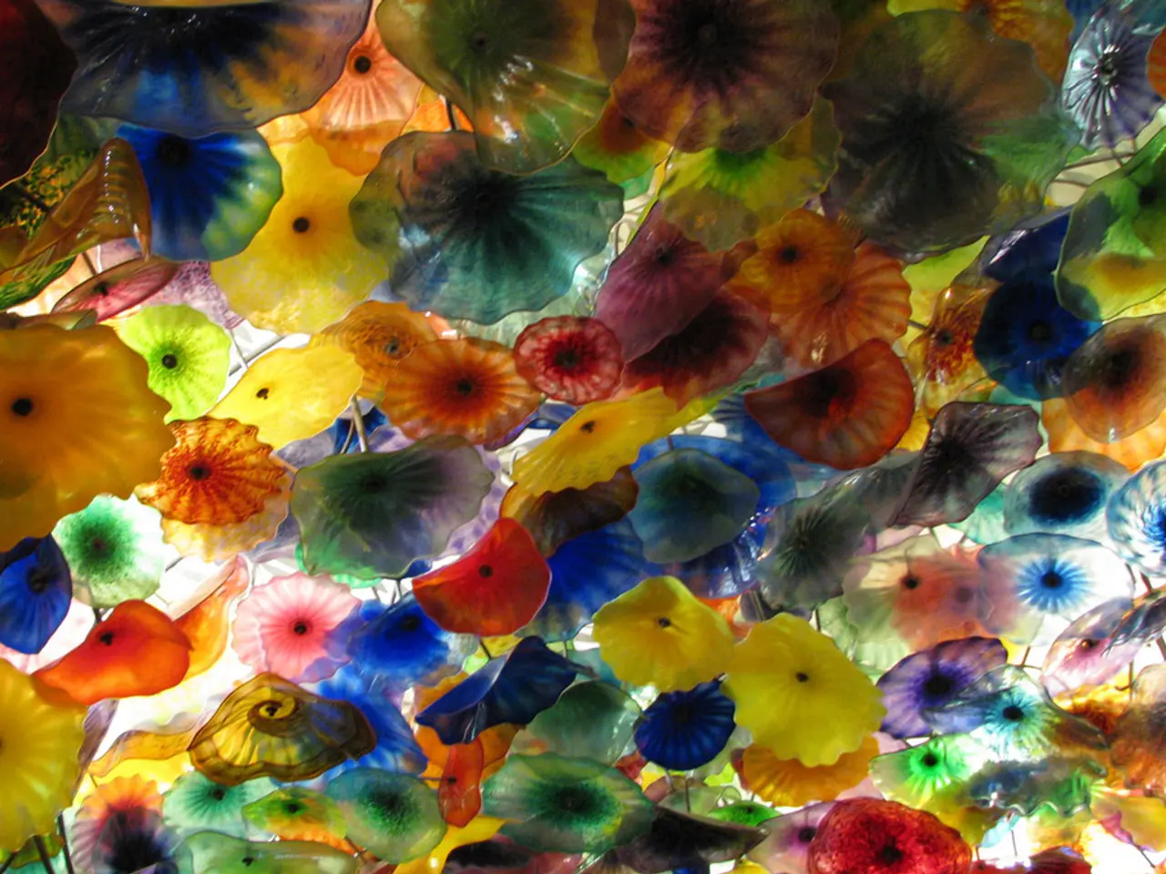
Complementary colours, pairs of colours that are opposite each other on the colour wheel, create a strong contrast when placed next to each other. This contrast can be used to great effect in art and photography, evoking a sense of tension or harmony depending on the context.
In photography, understanding how different colours interact with each other is essential for achieving specific moods and emotions in photographs. For example, warm colours like red and orange can evoke feelings of passion and energy, while cool colours like blue and green can create a sense of calm and tranquility.
The application of colour theory is not limited to traditional art mediums. In digital art, artists can utilise software tools to apply different colour theories to their work, taking advantage of digital brushes and layers for specific effects. This digital revolution has opened up a world of possibilities for artists, allowing them to experiment with colour in ways that were previously unimaginable.
In conclusion, mastering colour theory is essential for artists who want to effectively communicate their ideas and evoke specific emotions in their artwork. Whether it's through the traditional mediums of painting and drawing, or the modern medium of digital art, understanding colour theory provides artists with the tools they need to create visually stunning and emotionally impactful works of art.
Read also:
- Peptide YY (PYY): Exploring its Role in Appetite Suppression, Intestinal Health, and Cognitive Links
- Toddler Health: Rotavirus Signs, Origins, and Potential Complications
- Digestive issues and heart discomfort: Root causes and associated health conditions
- House Infernos: Deadly Hazards Surpassing the Flames


