Creating Inclusive Brochures: A Comprehensive Handbook
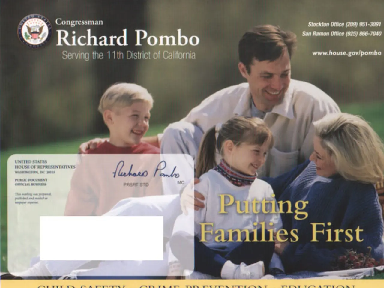
In today's digital age, creating accessible brochures is not just a recommendation, but a necessity. An accessible brochure is a physical or digital document that can be easily read, understood, and navigated by a wide range of individuals, including those with disabilities.
The goal of an accessible brochure is to provide information and content in a way that is inclusive and barrier-free. This is achieved by adhering to certain principles and guidelines.
Clear Information Hierarchy
Accessible brochures should have a clear information hierarchy for easy navigation. This means that the structure of the brochure should be organised in a logical and consistent manner, making it easy for readers to find the information they need.
Simplified Content
Stick to using plain language and simplifying content to make brochures accessible. Complicated language can be an accessibility barrier for people living with cognitive disabilities or for people who speak English as a second language.
Keyboard Navigation-Friendly
Accessible brochures should also be keyboard navigation-friendly. This means that all interactive elements, such as links and buttons, should be easily accessible using a keyboard, rather than relying on a mouse or touch screen.
Contrast and Colour
Maintaining appropriate color contrast between text and background is fundamental to accessible brochures. WCAG 2.2 suggests a minimum contrast ratio of 4.5:1 for regular text and 3:1 for larger text to make documents accessible. The WCAG Color Contrast Checker can help ensure a brochure meets WCAG requirements.
An accessible color palette should be used in brochures, and text alternatives should be provided in areas where color is used to convey meaning. The Color Blind Simulator can be used to test designs to see how they look to people with visual impairments.
Links and Images
Descriptive and meaningful anchor text should be used for links in brochures to convey the purpose or destination of the link. Adding descriptive alt text to images, graphics, and illustrations in brochures helps individuals living with visual disabilities understand the meaning and context of visual content.
Inclusive Design
Creating accessible brochures is the right thing to do, as it increases visibility, builds brand reputation, and increases the bottom line. Our platform offers diverse icons and illustrations to ensure brochures are inclusive and accessible.
Legal Requirements
In some countries, there are legal requirements to make digital content, including brochures, accessible. Failing to make brochures accessible can cost businesses in remediation costs and even litigation. In 2022, there was a 12% year-over-year increase in web accessibility lawsuits in the US alone.
Free WCAG-Compliant Brochure Management Tool
The search results do not clearly identify a specific company offering a tool to manage brochures that are WCAG-compliant and can be created for free. However, our platform offers such a tool - the Accessible Design Tool. This tool allows users to test changes for color contrast compliance, alter the look and feel by selecting WCAG-friendly color palettes, set alt text, edit the reading order, and more.
In conclusion, creating accessible brochures is not only a legal requirement in some countries, but it is also a matter of social responsibility. By following the principles outlined above, businesses can ensure that their brochures are accessible to everyone, enhancing readability, usability, and overall user experience.
Read also:
- Peptide YY (PYY): Exploring its Role in Appetite Suppression, Intestinal Health, and Cognitive Links
- Toddler Health: Rotavirus Signs, Origins, and Potential Complications
- Digestive issues and heart discomfort: Root causes and associated health conditions
- House Infernos: Deadly Hazards Surpassing the Flames
