Applying the Proper Layout to Your Poster: A Step-by-Step Guide
A well-designed poster is a powerful tool for marketing events, and understanding the key elements of an effective poster layout can make all the difference.
Firstly, an eye-catching title or slogan, smart use of whitespace, consistency in design, an appealing color palette, overall contrast, focused content, and an appropriate size are all crucial elements of an effective poster. Starting with a template is the easiest way to get started, as it provides a solid foundation for your design.
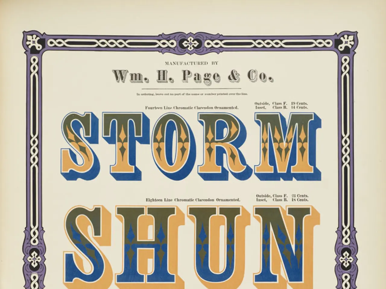
The color palette you choose can help speed up the time it takes for your audience to form a connection to what they're seeing. To ensure the hue selection only emboldens the message, it's important to use the tenants of color theory and psychology. A two-tone color palette with high contrast is used to attract eyeballs and make graphic elements stand out.
The poster layout refers to the look, feel, and organization of elements in a poster. For a marketing poster, the main goal is to get the target audience (marketers) to attend the event. A two column layout is chosen for this purpose, as it delivers all necessary information and keeps the design clean, polished, and professional. This layout distributes information within two distinct zones on a single page, making it easy for the audience to absorb the information.
Icons are used to communicate meaning through graphics and engage people more than text. They can be used to highlight key points, such as the event title, date, time, location, and where to find more details. Simplicity in poster design tends to win out, so it's important to use icons sparingly and effectively.
The choice of poster layout should be based on the goals of the poster. For example, a multi column or hybrid layout is effective when there is a lot of information to cover, several call-to-actions, or when visual icons need to be added to several distinct sections. On the other hand, a one column layout organizes information within a single vertical column, simplifying the reading experience.
For a post-graduate career expo poster, a single column layout featuring a bold title and large font size, complemented by a graphic of the target audience, conveys this information effectively. For a student conference poster, the message should be precise, direct, and include some element of emotional appeal.
In conclusion, designing an effective poster requires careful consideration of the layout, color palette, and design elements. By following these guidelines, you can create a poster that captures and funnels attention towards a desired action, ultimately helping to promote your event successfully.
Read also:
- Peptide YY (PYY): Exploring its Role in Appetite Suppression, Intestinal Health, and Cognitive Links
- Toddler Health: Rotavirus Signs, Origins, and Potential Complications
- Digestive issues and heart discomfort: Root causes and associated health conditions
- House Infernos: Deadly Hazards Surpassing the Flames
